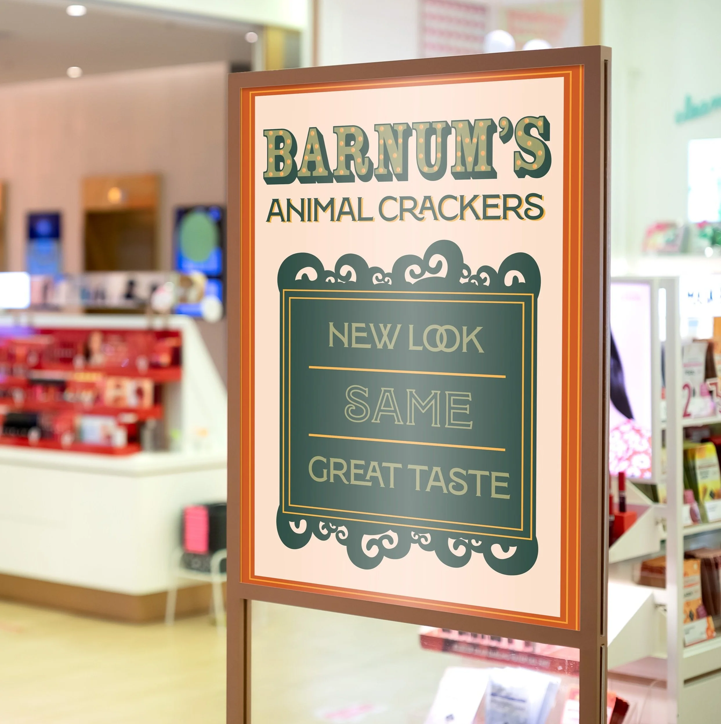
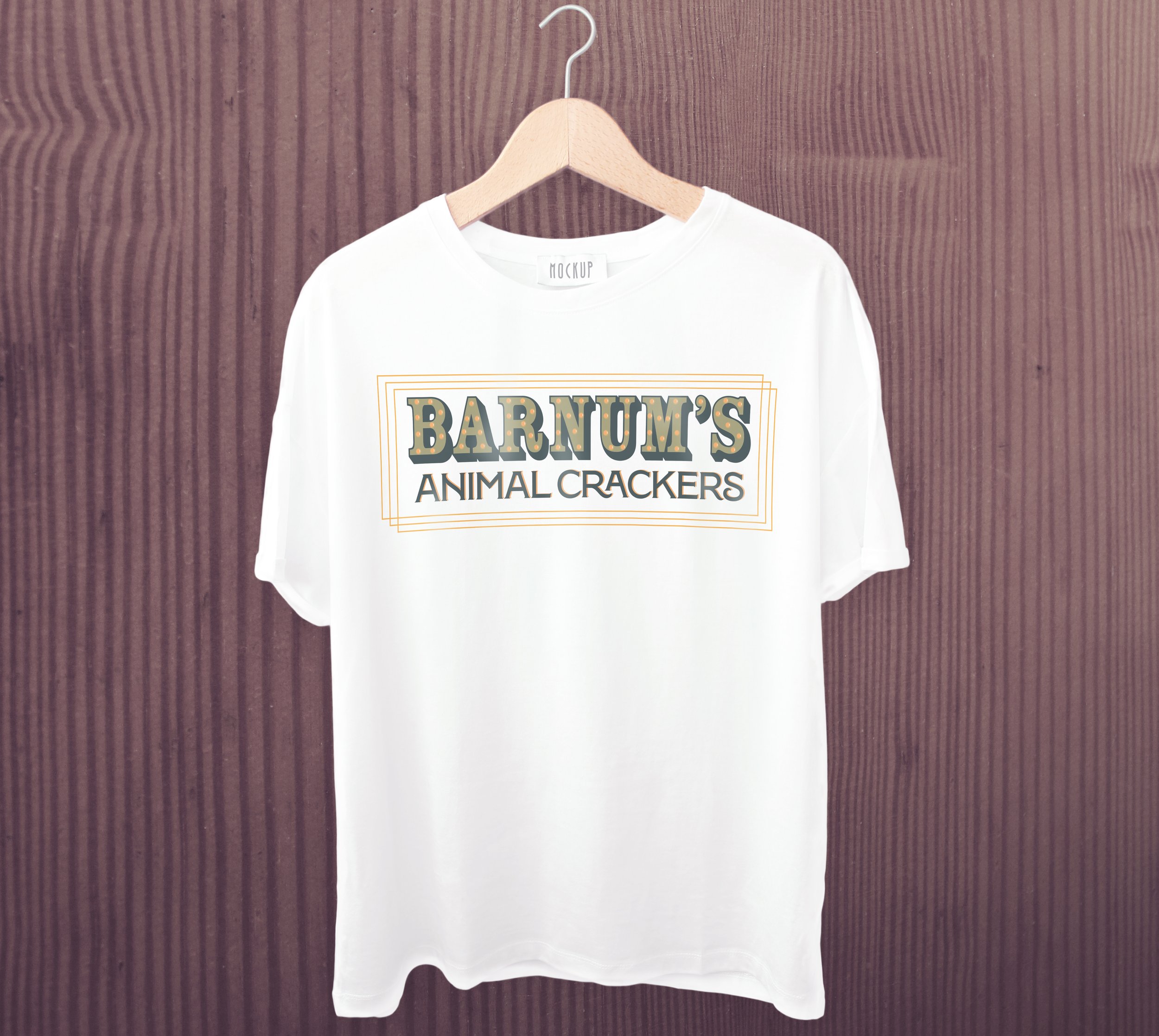
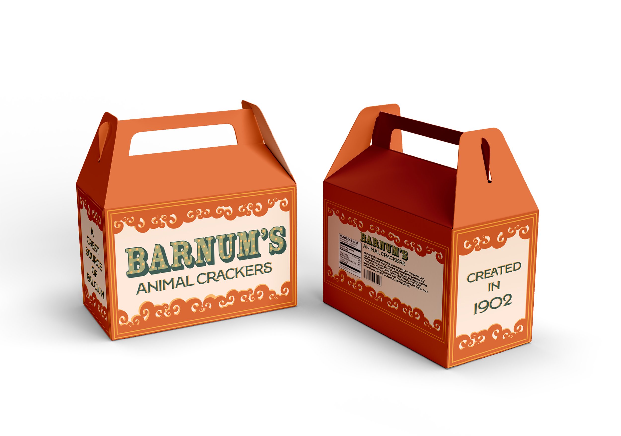
BARNUM’S ANIMAL CRACKERS
Barnum’s Animal Crackers has been overdue for a rebrand of their packaging as they’ve failed to create new content for decades. In an effort to create something new that is unforgettable while also holding strong to the brand’s original content, I have successfully kept to the roots of the brand by keeping a circus animal theme. Adapting the logo into a family friendly style by creating a carnival look obtains a simple and memorable addition without taking away from the simplicity of the scroll-like border. Barnum’s Animal Cracker packaging now envelops a unique and straightforward design that is both eye-catching and unique.